Improvements in Swiss life expectancy and length-of-life inequality since the 1870s
KOF Bulletin
Over the past 140 years, female Swiss life expectancy has increased from 58.4 years in 1876 to 85.6 years in 2016. Male life expectancy has increased from 56.3 years in 1876 to 81.9 years in 2016. Most of these gains are due to a larger share of the Swiss population reaching old age, while a small remainder of the gains is due to an increase in old age itself.

Life expectancy (LE) is defined as the age that a person of a particular age is expected to reach based on the age-specific mortality rates prevailing at a specific point in time. Because LE is based on past mortality rates and not on the mortality rates experienced throughout an individual’s life, it does not accurately reflect how long individuals may expect to live. It does, however, provide an overall indication of the health performance of a society at that moment in time. This study measures LE as the average age of death from age 15 onwards.
As with all averages, LE does not consider the extent to which life-years are unequally distributed among population members. Length-of-life inequality (LI) is one of the most fundamental forms of inequality. LI is measured by computing the Gini coefficient over the distribution of age at death from a given population from age 15 onwards. The Gini measures to what extent the distribution of life-years within society differs from a perfectly equal distribution. A value of 1 represents perfect inequality, while a value of 0 represents perfect equality. Whereas other forms of inequality – such as that of income, wealth, education or occupation – might be compensable using redistributive policies, a high level of LI indicates that a substantial share of the population has died prematurely: a situation from which no recovery is possible.
Historical Swiss life expectancy
Chart G 11 shows the trajectory of LE in Switzerland from 1876 to 2016. In 1876, Swiss LE was about 58.4 years for women and 56.3 years for men. Swiss LE then increased fairly steadily to 85.6 years for women and 81.9 years for men. Around 1918 we observe a sharp drop in LE for both Swiss men and women despite Swiss neutrality in World War I. This dramatic drop is the result of the Spanish Flu, which was wreaking havoc upon most of the world’s population. Chart G 11 also shows that initially, although Swiss women consistently lived longer than Swiss men, male and female life expectancies were similar. Over time they slowly diverged up to 1991. At that point, Swiss women were living 6.8 years longer than men. After 1991 they slowly converged. In 2016, Swiss women were living 3.8 years longer than men.
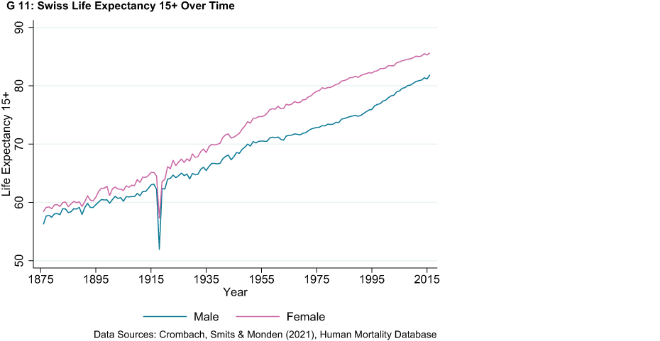
What can we expect from future LE? Such developments are extremely important, as longer lives combined with low fertility rates significantly impact the costs of healthcare and threaten the sustainability of pension systems. Although there is no clearly observable decline in the growth of male LE, the growth of female LE has declined over time. This is to be expected, as LE can only grow as a result of (i) technologies that lengthen the maximum human lifespan or (ii) by increasing the proportion of people who grow old. This means that LE growth is large at first as both factors are important but, at some point in time, LE will only grow as a result of technologies that increase the maximum human lifespan. In other words, LE growth will ultimately fully depend on advances in medical science. Whether or not LE will continue to grow thus depends on those advances.
Historical Swiss length-of-life inequality
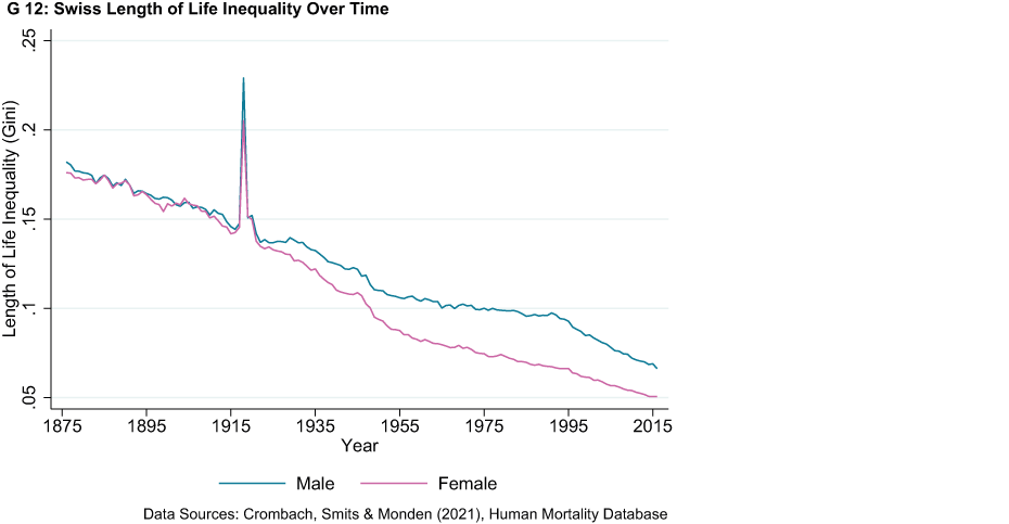
Chart G 12 shows the trajectory of LI in Switzerland from 1876 to 2016. LI dropped by 71.2 per cent for women and by 63.6 per cent for men over a period of 140 years. The life-years available in Switzerland were thus much more equally distributed among the Swiss population in 2016 than in 1876. Chart G 12 closely resembles the time pattern of LE in Chart G 11. The book chapter underlying this article shows and explains that LI and LE are mechanically correlated. This is because increases in LE are mostly the result of health technologies that enable individuals to reach old age, as opposed to health technologies that increase old age itself. The article elaborates on this phenomenon in the next section.
The relationship between life expectancy and length-of-life inequality
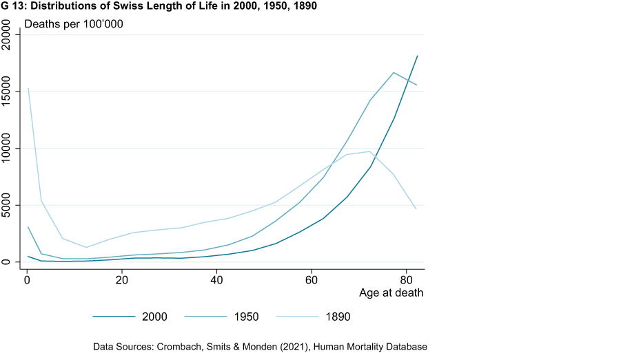
Chart G 13 shows the number of deaths per age group for every 100,000 deaths in Switzerland in the years 2000, 1950 and 1890. These data illustrate several interesting developments. Firstly, infant mortality was high in 1890, accounting for as much as 15 per cent of all deaths. Infant mortality was almost eradicated by 2000 as a result of improved sanitary practices and the diffusion of new and more effective medicine. Secondly, Chart G 13 shows that life expectancy has improved over time, with more people reaching older age in 2000 than in 1890. Thirdly, Chart G 13 shows that most improvements in life expectancy are not the result of significant increases in the maximum lifespan of humans but, rather, are because a larger share of the Swiss population reach older age. This becomes clear when one notices that most variation in the distributions over time occurs on the left-hand side of the old-age peaks. Consequently, life expectancy and length-of-life inequality are correlated to such an extent that it is difficult to extract any new information from length-of-life inequality patterns that we have not already learned from life expectancy patterns.
Historical Swiss relative length-of-life inequality
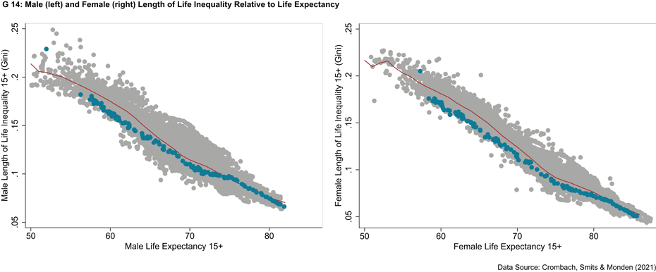
While LI remains a valuable indicator of equality, it cannot properly capture differences in resource allocation between societies with differing levels of life expectancy. This is due to the mechanical relationship between LE and LI. Thus, if one is interested in differences in LI for reasons other than changes in LE, one must look at a society’s LI compared with societies in similar LE groups. Chart G 14 does this for men and women separately. It shows the relationship between LI (vertical axis) and LE (horizontal axis) for the entire data set with 15,144 observations for 203 countries (grey) and for Switzerland (blue). The red line shows the average value of LI in each LE bin. Chart G 13 shows that Switzerland performs well in terms of LI relative to countries with similar levels of LE. Switzerland has consistently outperformed its peers for both male and female LI. The country has often been among the best performers for female LI between an LE of 60 and 70 years. In recent years, however, Switzerland’s LI has moved towards the average of its peers.
References
Crombach, L., Smits, J., & Monden, C. (2021): "Life expectancy and length of life inequality in the long run", in How Was Life? Volume II: New Perspectives on Well-being and Global Inequality since 1820, OECD Publishing, Paris, external page https://doi.org/10.1787/aa9ad684-en.
Smits, J., & Monden, C. (2009), "Length of life inequality around the globe". Social Science & Medicine, 68(6), 1114-1123.
Contact
Professur f. Wirtschaftsforschung
Leonhardstrasse 21
8092
Zürich
Switzerland