A view from space: satellite data to measure inequality
KOF Bulletin
Economic inequality across much of the world has increased in recent decades, which is linked to social and economic trends. However, any study of the causes and effects of this phenomenon is hampered by the limited availability of consistent inequality data. A KOF study constructs a measure of inequality based on satellite data. The basic idea is that light intensity reflects economic activity in a geographical unit.

Compiling global inequality databases poses several challenges. The sources and methods used vary considerably in terms of their quality and availability across countries as well as within the same country over time. Traditional inequality measures typically rely on a mixture of national accounts data, household survey data and tax returns. All of the above sources have their challenges. For example, household surveys tend to sample too few wealthy households. National accounts and tax data are often unavailable, especially in developing countries. Other challenges include tax evasion and other informal activities. These measurement errors can generate biased results and inferences. Moreover, a combination of different sources does not produce a complete data set.
New approach: inequality measure based on satellite data
This study aims to construct a measure of economic inequality using satellite data. Similar to the prevailing economic literature, the study approximates economic activity with light intensity. Importantly in this context, light intensity captures not only income but also wealth, consumption, and spending on investment and infrastructure. For this reason the resulting inequality measure reflects not only income inequality but also general economic inequality in a country.
To do this, the study uses night-time light activity (Night Lights) provided by the Defense Meteorological Satellite Program (DMSP), a weather satellite programme of the US Armed Forces. These data measure light emission around 9pm between latitudes 75° north and 65° south. All countries in the world fall within this spectrum, with portions of very northern countries cut off. This is not a great loss, however, as these areas are virtually unpopulated.
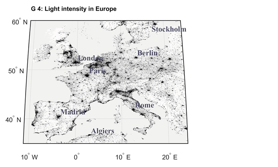
Satellite data offer several benefits. One of these is their availability: they cover all countries of the world since 1992. The study uses annual data on average light intensity, which ranges from 0 to 63, where 63 corresponds to the highest light intensity. Another benefit is the data’s geographical granularity: each observation unit covers only 30 arcseconds, which corresponds to about one square kilometre at the equator. This observation unit is also called a pixel. The data thus measure the annual light intensity for each square kilometre. Chart G 4 shows the light intensity for Europe. Darker colouring indicates higher light intensity. The urban regions of Europe are clearly visible. The cities in particular are very darkly coloured. The Alps, on the other hand, are almost white.
Satellite data in economics
The use of satellite data, especially data on night-time light intensity, has increased enormously in economics. Economists use these data primarily as an indicator of economic activity. Henderson et al. (2012) and Pinkovskiy and Sala-i Martin (2016) use these data to supplement national accounts in order to estimate GDP growth rates even in countries where adequate data are not collected. Other applications can be found in regional analysis (Hodler and Raschky, 2014) and in calculations of ethnic inequality (Alesina et al., 2016).
Where does the population live?
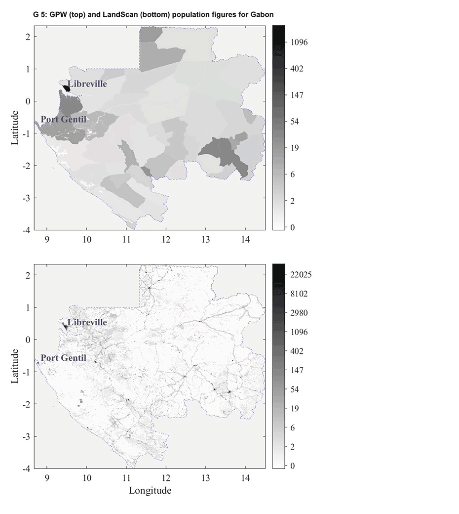
To calculate a measure of economic inequality, we need information not only on economic activity but also on population. For population, the study uses two different sources, namely the Gridded Population of the World (GPW) provided by Columbia University and the LandScan data from the Oak Ridge National Laboratory. Both sources offer benefits and drawbacks. The GPW data include census data collected at the regional level that are disaggregated to the level of a pixel. Consequently, the population within a census region is divided equally among all pixels. Portions of the population may therefore be allocated to areas that are actually unpopulated. To avoid such measurement errors, the study aggregates light intensity for census regions and thus constructs a measure of inequality at the census region level.
LandScan data, on the other hand, are collected directly at the pixel level by combining census data with other data on land cover, roads, urban areas, localities and other indicators. These data therefore map the population in much greater detail. The differences can be observed in Chart G 5. The drawback with these data, however, is that they have limited comparability over time, as information improves significantly over the long term. Consequently, there is a risk that changes in population size in a given area are caused by improved data quality rather than by migration.
In summary, the GPW data reveal a more consistent picture over time, while the LandScan data provide a more detailed look at the geographic distribution of the population. To take advantage of the respective benefits of each source, the study combines both datasets and constructs inequality measures based on both sources.
Calculating inequality: satellite data meet population data
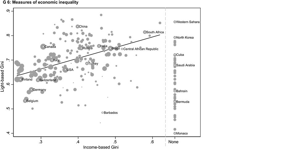
In order to calculate economic inequality the satellite data are combined with population data. The study uses the conventional approach of Gini coefficients. In the absence of individual income data the study calculates inequality based on the respective geographical units. This approach thus substitutes individual incomes for economic activity in a pixel. One pixel is roughly equivalent to one square kilometre of an area. Given the different sources of population size, different Gini coefficients are calculated for each source. A weighted measure of inequality is then calculated from these different coefficients. The weightings are chosen according to their correlation with a widely used database on income inequality, namely the Standardized World Income Inequality Database (SWIID). This approach is justifiable because income inequality accounts for a large proportion of economic inequality. Chart G 6 provides an overview of the resulting measures of economic inequality for each country, with each point representing the average for the years from 1992 to 2013. The vertical axis measures the Gini coefficients calculated from the satellite imagery, and the horizontal axis maps the Gini coefficients from the SWIID.
The size of the points indicates the quality of the SWIID data. The larger the point, the higher the quality. Chart G 6 shows a positive correlation between the two inequality measures. This correlation is particularly strong for countries that have a high quality of data in the conventional measures. This measure thus maps well to economic inequality. The right-hand side of Chart G 6 also shows the inequality values for countries that do not have inequality data from conventional databases. The measure used for these countries represents a particularly important contribution to inequality research.
Relevance to research and society
Since analysis of economic inequality has increased considerably in recent years, an appropriate measure is indispensable. It is thus a particularly high priority to extend such analysis to developing countries. These countries often cannot rely on conventional methods of approximating income and wealth as such data are often not collected in the first place. The measure of inequality outlined here is therefore particularly relevant to developing countries. However, satellite data can also contribute to inequality research in developed countries. Access to detailed microdata remains difficult even in wealthier nations. Moreover, the calculations used differ from country to country. This study attempts to use its data to contribute to future research that is relevant to society.
The satellite data are freely available for download external page here.
Literature
Alesina, A., Michalopoulos, S., and Papaioannou, E. (2016). Ethnic Inequality. Journal of Political Economy 124(2), 428-488.
Galimberti, J. K., Pichler, S., and Pleninger, R. (2021). Measuring Inequality using Geospatial Data. KOF Working Papers No. 493.
Henderson, J. V., Storeygard, A., and Weil, D. N. (2012). Measuring economic growth from outer space. American Economic Review 102(2), 994-1028.
Hodler, R., and Raschky, P.A. (2014). Regional Favoritism. The Quarterly Journal of Economics 129(2), 995-1033.
Pinkovskiy, M., and Sala-i-Martin, X. (2016). Lights, Camera... Income! Illuminating the national accounts-household surveys debate. The Quarterly Journal of Economics 131(2), 579-631.